Victor Allen’s Coffee - Rebrand
Victor Allen’s Coffee logo was in need of a little revamping. I wanted to create a logo that was more modern but fun. With creating that fun but more modern look, I wanted it to be able to attract a wider audience. With this rebrand I wanted to change the design style completely from its original. Victor Allen’s Coffee’s original design felt out dated and not as inviting as their coffee and story is. I wanted to change that by bringing in fun but modern designs to the logo and the packaging. Three flavors I focused on were vanilla morning blend, pumpkin spice, and french roast.
concept

Logo Sketches
Final Logo
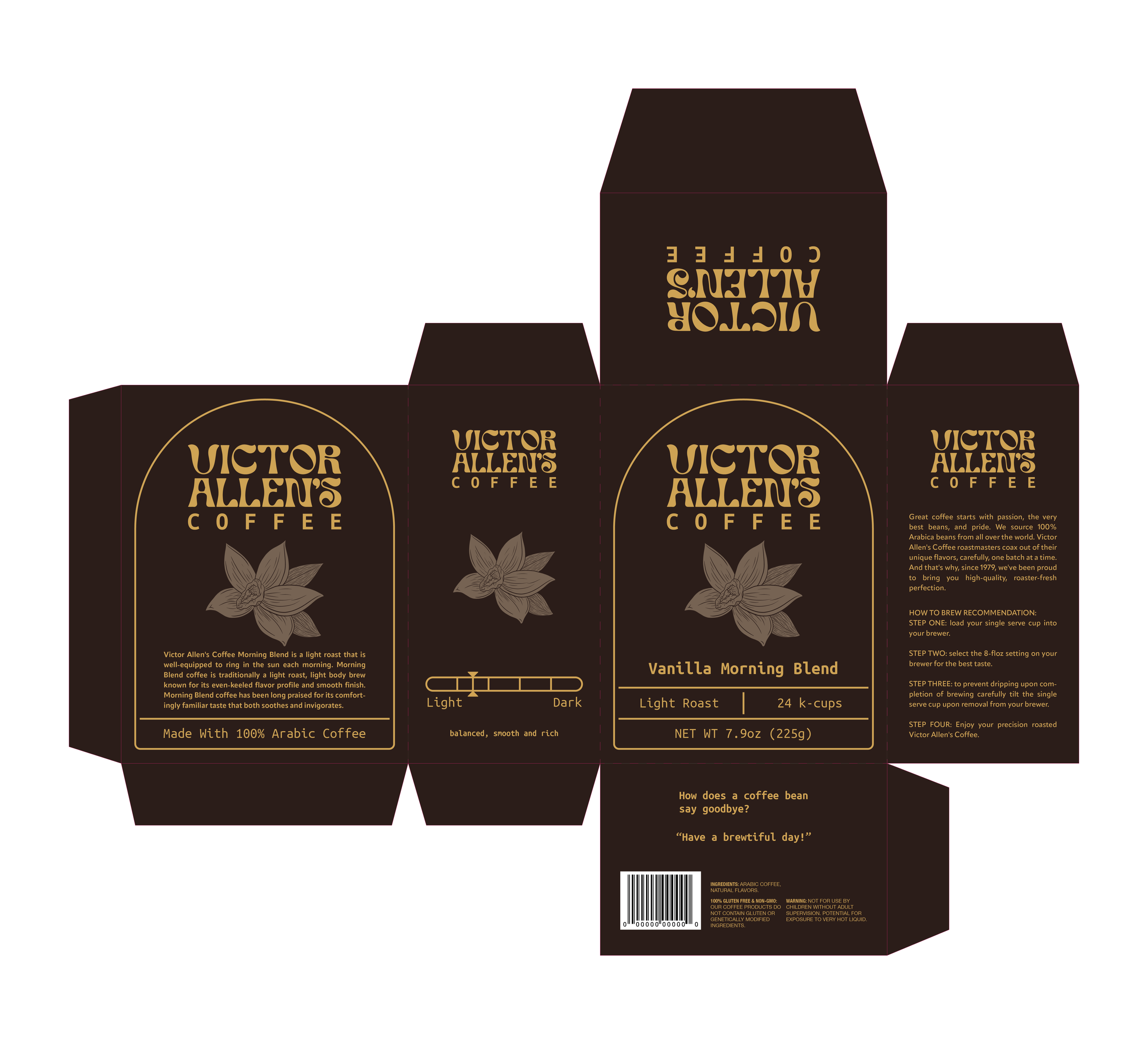
Victor Allen’s coffee packaging needed a change. It is old and outdated. By playing around with color and typography I wanted to bring Victor Allen’s Coffee packaging to life to feel more inviting when seeing it on the shelf. To make it more inviting, I messed around with color coding for each flavor. brown, yellow, and tan for vanilla. Orange, brown, and green for pumpkin spice. Lastly, different shades of purple for french roast.


